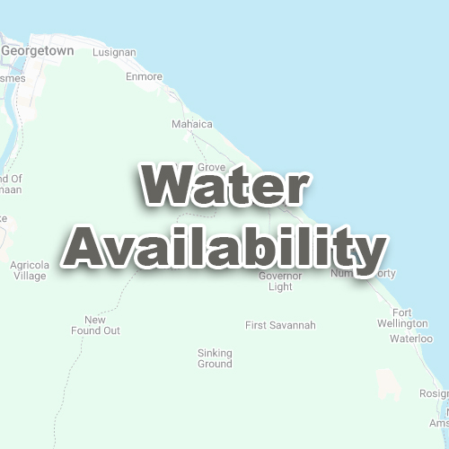
The Water Availability Index is a calculation that uses satellite images to show where water is present.
It highlights areas with water, such as ponds, rivers, or wet soil, and helps farmers make decisions about irrigation, drainage, and water management.
The Water Availability Index will display as a map with different colours or shades.
These colours show how much water is present in different parts of your land.
Blue colours on the map often indicate rivers, lakes, or wet soil.
Dark colours or reddish shades on the map suggest dry soil, crops, or built-up areas.
Irrigation Planning:
See which parts of your land are too dry and need water.
Flood Monitoring:
Identify areas that are waterlogged and at risk of flooding.
Crop Health:
Wet soil may help certain crops, but too much water can harm others.
Drainage Management:
Know where to add or improve drains to stop waterlogging.
Water Availability maps should be combined with what you see on your farm. Walk your fields to confirm what the map shows.
The results depend on how recent the satellite image is. If the image is old, conditions may have changed.
Weather, like rain or drought, will affect NDWI results. Use it regularly to track changes.

